Mountains of research by behavioral psychologists have shown that we all make judgments much faster than we would ever think we do and that our perceptions are influenced by incredibly subtle nuances we’re often not consciously aware of. Studies are now showing that color plays an enormous role in the snap decisions we make, so it comes as no surprise that the colors used on your website and in marketing materials can have a HUGE effect on your conversions – so let’s jump in and make sure you get this right…
Why Your Color Choices Matter
Malcolm Gladwell’s bestselling book Blink gave the general public a glimpse into how quickly our perceptions and decisions are formed, the incredibly small amount of information they’re based on, and how unlikely we are to change them – regardless of how much additional information we learn later. Research published in the journal Behavior and Information Technology has shown that users draw a positive or negative judgement about the website they’re visiting in the first 50 milliseconds of viewing.
To give that a little perspective, that’s 10 TIMES faster than the researchers thought it was even possible for people to see information at!
What’s important to take away from the research isn’t just how fast conclusions are made, but what factors are playing a role to determine how visitors will judge your website. Considering that decisions are being made in less than half the time it takes to blink, color is one of the ONLY things that can be perceived at that speed. In fact, research suggests that up to 90% of initial impressions are based ONLY on color.
Where and When to Consider Online Color Choice
When you’re deciding what the color scheme of your website should be, it’s not enough to just pick whatever your favorite color is, or the team colors of your alma mater, or what your Aunt Gertrude think looks best. Let’s walk through the things that need to be considered:
Who is your audience? – For a number of important reasons, the more specifically you can identify who your most likely customer is, the better.
Will your audience be mostly women or men? Will they usually fall within a particular age range? Will they share a common characteristic such as being parents, athletes, or tech-savvy?
How do they feel? – Think about what your website visitors will be feeling when they search for your product or service and how you want the experience of being on your site to relate to those emotions.
If your business is a funeral parlor, it’s a pretty good bet that people who land on your website are going to be solemn rather than chipper. It’s probably not a good idea to try and change that feeling either (bad time for humor), so your color scheme should reflect that mood by utilizing darker and more neutral colors.
On the other hand, if you run a business that rents bounce houses for kids birthday parties, your visitors will likely be pretty upbeat and your color scheme should be fun and playful, with bright and vibrant colors.
How do you want to position your business or product? – Positioning is where your product, service, or brand fits into the marketplace in the mind of the consumer.
If you want your product to be perceived as luxurious, you may want to select black, grey, silver, or gold colors. If you want to elicit feelings of passion, energy, and excitement, a red color palette is a good choice.
The Color Selection Cheat Sheet
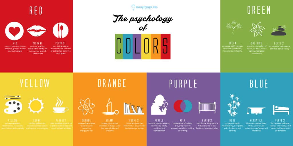
- Women don’t typically respond well to gray, orange, or brown. Instead, they favor blue, purple, and greens. While pink represents femininity, it isn’t a color women tend to rate positively.
- Men prefer blue, green, or black more than purple, orange, or brown.
- Blue is usually a safe color choice since it’s a favorite of both genders and it conveys both trust and serenity.
- Yellow is used to represent a warning, so it’s better to limit its use in your online design and let it do its thing on wet floor signs and construction tape.
- Green is synonymous with nature and the environment, as well as money. No shocker here.
- Orange conveys energy or activity and is considered loud and noticeable, which is why it’s so often used on call to action buttons such as “Add to Cart” or “Buy Now.”
- Red is stimulating and represents love, passion, or danger.
- Black is associated with luxury and power and can be a good choice for high end consumer goods, but also symbolizes evil or the “bad guy,” so if you’re primarily attempting to establish trust, it may not be the best choice.
Watch Out for the Exceptions
Remember, these are guidelines, not rules, and like most things in life, there are exceptions to keep in mind. For instance, blue performs terribly when used in relation to food. The negative effect of the color blue is so powerful that serving food on a blue plate has been shown to result in people eating less! It’s theorized that in nature blue often represents poison, which is why there are so few foods that are naturally blue other than blueberries.
Additionally, although yellow is strongly associated with warnings and things to avoid, it can pair well with products and services related to children and in that context can symbolize happiness and sunshine.
Make Sure it Fits
Recent research suggests that when it comes to your business and product design, what may be even more important than the particular color itself, is how well the color “fits” the consumer’s perceptions of what your product stands for.
Harley Davidson motorcycles are correlated to being “tough” in the consumer’s mind, so having a black logo makes sense. Brown is usually a poor design choice, but not when it fits the product, such as in a logo for a coffee shop. If you’re selling Christmas ornaments you can pick any colors you want, as long as they’re red and green.

The Isolation Effect
When you want to draw attention to some element of your website, such as your call to action buttons, you should keep in mind something known as “The Von Restorff Effect” or the “Isolation Effect,” which basically states that we place more importance and pay attention to things that stand out. As an example, if your website has a green color scheme, it may be good to consider using a red or orange “Subscribe Now” button, while a green button can perform well on a website with a purple color palette.
You can see below how much the call to action button stands out on the page even when the page is taken out of focus.

Generally, your call to action buttons should be bright colors such as red, green, orange, and yellow and you should take steps to make sure they stand out on the page. Amazon has been so influential as an online retailer that it has virtually trained the public at large to look for yellow buttons when they’re ready to make a purchase.

The Most Important Color of All
The most important color by far is none at all – whitespace. When you’re designing your marketing and website, remember to keep things simple, clear, and as uncluttered as possible. Great design isn’t when nothing more can be added, but when nothing more can be taken away.
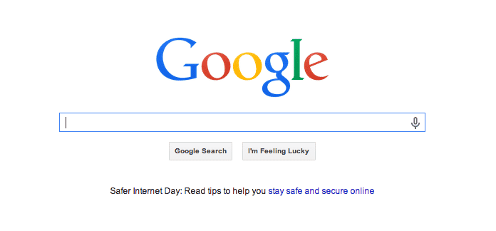
The simplest website you’re ever likely to see is Google and no company is more known for minimalistic design than Apple, so follow their lead and edit, edit, edit.

Finding the Perfect Colors for YOUR Business
Everything we’ve been talking about is based on generalizations, but what will ultimately work best for YOUR business is highly variable so use what you’ve learned as a guide to help you determine where to start, but not necessarily where to stop. Only testing and measuring can tell you what will perform the best for your individual situation, and it may take a few redesigns to figure that out for sure, and that is where a service like Optimize Wise can be of tremendous help by giving you the time to focus your attention in other areas of your life and business while we handle all the design, development, and testing of your website and online marketing.
Take some time to think about your business, the experience you want your customer to have, and if your color choices are the best options – then get busy testing and finding out if your predictions were right!
LET'S START YOUR PROJECT!

CONTACT US
1-844-287-9695
100 Commons Rd. Suite 7-104
Dripping Springs, TX 78620
512-270-3741
Email: info@enlightenedowl.com


